We continue our look at the upcoming NHL season’s jerseys, the Adizero!
Scott: Next up are the LA Kings!
Keith: So they moved a stripe from the shoulders over to the collarbone? And then they made the backdrop of the NHL logo below the collar black? Is that it?
I guess L.A. is going for ‘more black’ as a rule, fully devoting themselves to having the ultimate “bad guy’ jersey from a sports movie. They haven’t had a single thread of purple in their jersey since 2013. For shame! Shame!
Scott: There is of course not enough purple and gold in this jersey. I don’t know why the NHL is so afraid of purple as a general rule. The NBA uses it liberally, and the Raven in the NFL and the Rockies in MLB are just fine with it.
That being said, the stripe moving down the shoulder and the collar going full black are both solid design choices. I have never liked the 90-degree angle where the stripes cross on the sleeves though, so I wish they had sorted that out this time around. But it’s a solid jersey from a team that has been able to put some truly awful uniforms on the ice, and I’ll not harp on their being black, as they were the first team in the league to lay claim to an all black sweater back in 1988.
Topher: I own an original all black jersey. I am good with the Kings black jersey, unlike some teams that force black down our throats and try to convince us they look good in black, the Kings own it. Always liked their logo. I for 1, really like this jersey. I also prefer the small change in the stripe placement. I don’t miss any purple and gold. I think there is a reason you can only name 1 team in each major sports that has purple in their jersey.
Keith, I’m pretty sure I read somewhere that only a handful of teams have a revamped jersey. For the most part, I think we will expect only minor tweaks.
Keith: I also like the thing where all the teams from a city have the same colour scheme though. Lakers & Kings rocking the same colour scheme was cool.
It was more just a general complaint that it seems Adizero means ‘no more third alts’ for a lot of teams.
Third alts are my jam.
Topher: Ya as much as I hate Pittsburgh, it is nice all their teams have the same colours, unlike Philly that’s green, orange, maroon and red/blue
I love me some 3rd jerseys. Spoiler alert, I’m thinking this Adizero has killed the Blue Jackets cannon jersey, one of my absolute fave and I’m not happy about it.
–
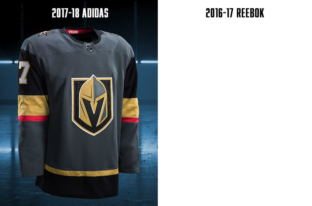
Scott: Next up is Las Vegas.
I don’t care that the team wants to be from “Vegas”, the city is still called Las Vegas.
New to the league and they’re coming in with… a mixed bag. Like “party mix”, where some of it is okay, and some of it is just Frito crumbs.
I hate that this jersey isn’t great. The logo is great, and that’s really special, but this jersey is both over-complicated and flat at the same time. Slate, black, glittery gold, red and white are way too many colours on a uniform, and the striping is… damned confusing.
Topher: Damn, Was not sure if we were doing Las Vegas next, or going by V. I wanted to be the first to slam this jersey. It is god awful. I hate everything about it. Slate grey? Basically concrete? When I think of Vegas, I don’t think grey. Random red stripe? Whats up with that? Don’t even like their logo. So expected, but I guess it IS what I should have expected with the name golden knights. They made a splash during the drafts and impressed, but they full on drowned on this jersey and. It’s so disappointing because they had all this time to impress us with it and fell flat. Another Jersey for Scott to buy to add to his collection of god awful jerseys.
At this point, Keith stopped replying for nearly 2 weeks.
Topher: The jersey is so bad it made Keith go blind and he can’t review it.
Keith: No that’s not true at all.
I’ve got so much to say you guys. Just you wait.
Six more days go by.
Keith: Ok. I’m back. Guys, Osheaga was crazy you don’t even know.
So the Knights are the NKOTB in the NHL this year and they are all but assured to make a decent amount of profit on jersey sales just by being an expansion team. And yet, this is what they come up?
I guess we get to pick apart the whole thing since, unlike 30 other teams Las Vegas had the chance to start from scratch and not be forced into matching conventions that in some cases are a century old.
First of all, I hate the logo. It looks like a pre-set logo in the Create A Team mode of EA’s NHL games. I hate the red stripe. The league needs more red? Why is that red stripe necessary? I hate how bland the shoulders are and I hate the “gold” that they chose.
This looks like the jersey that the team in the beer league that has a lot of money designs for themselves.
–
Next time, we’ll wrap up the Pacific division with the Sharks and ‘Nucks!
–
Scott is a writer and podcaster here at 9to5.cc. He was raised by a Bruins fan in Montreal but turned out okay. Take that, nurture vs nature!
Keith does a lot here at 9to5.cc. His favourite teams are the Hawks and the Habs, but he only really feels comfortable sporting one of those logos on the regular.
Topher is not part of the 9to5 crew, but he is taking the time to come down from the world of fantasy football to help lend a voice to the article. A lover of almost all things orange in jerseys.


