We keep going with our look at the upcoming NHL season’s jerseys, the Adizero!
Scott: Next Team up is the San Jose Sharks!

I like to think that no one even told the Sharks that there’d be new jerseys this season. Perhaps they still don’t know what’s happening. How would you guys break it to them?
Keith: There was that photo shoot with Jumbo and Burns just hanging out naked and being bros. Someone was going to pitch new ideas for the jersey to them that day but then they saw the sheer awesomeness of their bro powers and chickened out.
As long as the Beard Bros are both Sharks that jersey will never change.
And they will never make it out of the second round.
Topher: So this is basically the same jersey? Guess it is one of those not getting the make over. It’s always been a decent alright jersey, gets the job done, but so far it’s got to the blandest jersey. I do like seeing teal in jerseys. The thin yellow stripe albeit is strange, it does tie in with the stick in the shark’s mouth. Speaking of which, don’t think I ever noticed how robotic the shark actually looked till now.
–
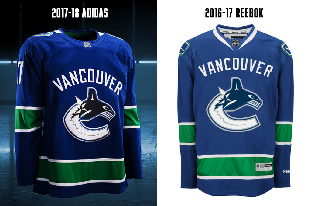
Scott: Yeah, lastly we have the Vancouver Canucks.

You can have the city, team name or a crest.
When you have both, you look like a dufus.
When you add in an animal mascot that is unrelated to the team name, you look like a dufus.
I also hate the Blue-Green-White scheme, but Vancouver has never been able to figure out the whole colour wheel thing.
AdiZero was a chance to really wipe the slate clean, a fresh start, but the ‘Nucks botched it again.
Keith: I feel like whoever designed this jersey got a memo from the Canucks saying “it’s important that at the end of the day you stick with our core values of ‘meh’. We want our jersey to accurately reflect the ideals of mediocrity that embody our team.”
Then that designer too a few weeks off work and came back being like “what if moved the alternate orca logo up onto the shoulders like dumb epaulettes?” and management was like “good job, here’s a raise.”
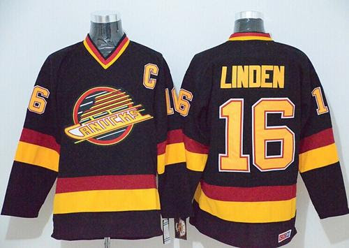
That’s the only reason I can think of that they passed on bringing back the 80s-90s jersey. That jersey is too good for the current values and aspirations of the team.

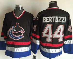
Scott: Better that than this:

or this:

This one was garbage too:

It can’t keep being an accident, can it?
Keith: I’m telling you man. It’s a clear statement from whoever builds the team. They took a look at the roster and they’re like “let’s dress the guys up in a jersey that nobody expects to see hoisting the Cup.”
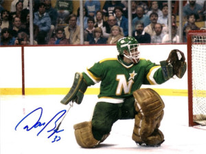
Scott: After some research, I think the Stars were the team to have worn the ugliest jersey while hoisting the Cup:

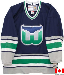
Topher: Ha! Guess I’m the only one who likes this jersey. Ok ok ok, the crest logo, with the exception of it making a C, has always been a WTF is this doing as their logo deal (bring back the stick!!). However, the dark blue, green combo? Love it, I personally feel this is an extremely underrated contrast of colours. You don’t see a lot of this combo and then they finish it off with a clean crisp sharp white colour font for the Vancouver letters? It also goes great with the Blue.
Does anyone else here feel like when viewing the photos of the old Reebok and new Adizero’s they make the Reebok ones look super colour faded like they have been left out in the sun for 3 years? A shameless marketing ploy by Adidas (and they own Reebok!)
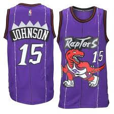
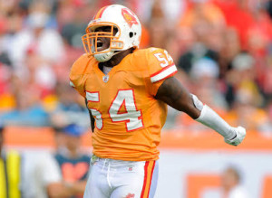
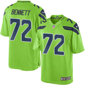
Scott: Few teams use analogous colours in jerseys, as it looks really odd.
Red – Purple:

Red – Orange:

Orange – Yellow: (SO rare I could only find this FC Barcelona example)

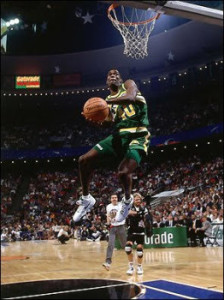
Blue – Green:


And the sole exception, the beautiful Yellow- Green:


–
Scott is a writer and podcaster here at 9to5.cc. He was raised by a Bruins fan in Montreal but turned out okay. Take that, nurture vs nature!
Keith does a lot here at 9to5.cc. His favourite teams are the Hawks and the Habs, but he only really feels comfortable sporting one of those logos on the regular.
Topher is not part of the 9to5 crew, but he is taking the time to come down from the world of fantasy football to help lend a voice to the article. A lover of almost all things orange in jerseys.


