Why Do Character Redesigns Piss People Off? – Perspicacious Geek
 I remember there was a line of dialogue in the first X-Men movie. It was just after the entire team had suited up for the first time in those leather costumes that basically became the “look” of the team in the movies and Wolverine makes some crack about their costumes. One of the characters, I think it was Cyclops, quips something along the lines of “would you prefer yellow spandex?”. An obvious crack at the fact that one of Marvel’s biggest baddasses, Wolverine, wears yellow spandex in the comic. A lot of people took issue with the costumed X-Men all donning similar black outfits in the movies but let’s face it, the producers were probably in the right to change up the costume. In a big budget action movie that’s trying to take itself at least a little seriously would Hugh Jackman in yellow spandex really be what you wanted to see in the climactic showdown with Magneto? It’d be a little weird to say the least. It seems that basically any time they redesign a character, especially when that character comes from an existing universe, creators get some flack.
Most recently, Suicide Squad has invoked the ire of geeks all over the internet with their redesigns of Joker and Harley Quinn. I’ll be the first to admit, that stupid “Damaged” tattoo on Joker’s forehead kind of rubbed me the wrong way too. The rest of the tattoos though? I didn’t mind. I liked the fact that he had grills too even. This is supposed to be a Joker who’s tangled with Batman in the past. Batman often beats the tar out of Joker before dropping him off at Arkham, so I think it’s pretty likely that Mr. J probably had a few of his teeth knocked out by the much more competent hand to hand fighter Batman. Harley seems to be a combination of her latest redesign from Suicide Squad in New 52 (which was also poorly received if I recall correctly) and part of her redesign she got in the Arkham Asylum video games with the dyed pigtails. So even then, they’re drawing from the comics, just apparently not the RIGHT comics for some fans.

Like, if you didn’t know better, these could be three different characters
Daredevil also took a bit of flack for his costume in the end of the incredibly enjoyable first season of Daredevil. Most of the articles that I saw complaining about took the most issue with the fact that the outfit isn’t completely red, like it is in the comics. Again though, I really feel like people don’t realize just how silly a completely red (or yellow) costumed character would look in these more “serious” interpretations of costumed heroics.

Those black little shoulder things caused a world of butthurt.
The other thing that I don’t really understand is that there’s almost always this negative reaction when a hero doesn’t look exactly the way he did in the comics. But guess what nerds, superheroes get redesigned all the time! Daredevil? He was yellow once. Hell, he was purple once. People are complaining that he has black in his costume when in the actual source material he did a stint in purple? Did I mention that while he was in purple he was possessed by a literal demon? Let’s lay off a few little buckles and some black, shall we.
DC launched the New 52 and gave redesigns to most of their characters. Batman has had like a million variations across his long history. Even Superman’s hair changed a bunch over the years. Remember mullet Superman? He was so edgy. He had a mullet! 90s! Mountain Dew!
Marvel isn’t much better, just take a look at the X-Men. Cyclops changes all the time, Storm rocked a sweet mohawk, Beast used to not be blue and hairy. Yeah, blue and hairy Beast that we all love was a redesign. You know what I think, I think it matters a lot more how a character is written and portrayed than their appearance. Who cares if they don’t look exactly the way they did in the comic (or the particular comic that you happened to like them in)? If they’re well written and acted then it’s fine. Do you know why Deadpool sucked in that Wolverine movie? Because they took away his ability to speak and be witty, which is like 90% of what makes Deadpool cool.
There have been plenty of cool redesigns that worked. Look at Daredevil again, Kingpin mostly in a black suit instead of a big white tuxedo with an ascot? That’s cool. Joker’s face being cut open with scars in Dark Knight? Also very cool. Who can forget the modern high-tech redesign of pencil? You know, mechanical pencil? It was just like pencil except it didn’t need sharpening all the time. Plus it made cool clicking noises. I’ll bet the first guy who used a mechanical pencil was like “Oh man, I like the original better.” That guy was a jerk.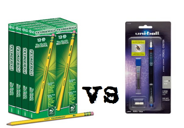 Or how about the time that they redesigned the President and they changed him from an old white Southern guy who couldn’t pronounce the world “nuclear” properly into this cool black guy who actually believes in climate change and does interviews with Vice Magazine. That President redesign was awesome.
 In conclusion, it doesn’t really matter what a character looks like when they get redesigned, it matters how well they actually portray the character. Creative people are creative. They’re going to want to bring their own unique ideas and visions into these existing worlds and characters. Just like when a new writer/artist picks up a comic things can change, when a character makes the jump to film or television, the same thing is bound to happen. So don’t judge a character by how they might look from a couple of still frames. Judge a terrible redesign by how it plays out on the screen (or the page). If they were just making exact remakes of stuff that had already happened in the comics, we’d all probably get bored anyhow.
All images of Marvel characters from Marvel Wiki.
Suicide Squad (Film) Harley from c0micbookmovie.com (Marvel Freshman) at least, that’s where I found them, they’re all over the place.
Other images from DC Comics. Pencils from Amazon
President images Public Domain.
Keith does all sorts of things here on 9to5.cc, he works with the other founders on 9to5 (illustrated), co-hosts our two podcasts: The 9to5 Entertainment System and Go Plug Yourself and blogs here as The Perspicacious Geek.